cover picture

UX Case: Events at DOKK1

client DOKK1 date May 2018 range of work UX / UI design

In this final exam project, our team was focusing on creating value for community centre by highlighting events targeted to specific audience.

The Client

DOKK1 is a community centre in the center of Aarhus, Denmark. It houses public library, citizens service, common areas, and many more. Its focus is put on sustainability, accessibility, and innovation.

dokk1 exterior
dokk1 website now

Their current website is not really user friendly as we found out during our research with actual users of DOKK1 facilities.

dokk1 how might we

Problem Statement

How can we highlight DOKK1’s recurring events, in order to increase youth attendance.

Team Management

This case was a final exam project that we executed in a team. Therefore I would like to introduce you to my fellow designers.

This team work was for me one of the most important yet. We were constantly facing a pressure due to the short time given for this project, but managed to cooperate well, and use all the time effectively.

From the left: Shereen, Melissa, me, and Florine.
dokk1 team

Research

Not knowing how to solve this problem yet, we assessed a big pile of papers on DOKK1, trying to really look at their business from different perspectives. We found the most painful problem, low attendance of youth. Doing not only desk, but also a field user research led us to decisions that made sense.
dokk1 sketches

User-Based Creative Process

Knowing our target audience’s goals and painpoints, we started with crafting first ideas. To make sure we are on the right track, we tried to consult our ideas and get feedback as much and relevant as possible.

For example our interest filtering buttons are based completely on feedback from the potential users. We also aimed to get professional feedback and critique from our classmates and teachers.

dokk1 workflow wireframes
dokk1 desktop mockups
dokk1 buttons palette
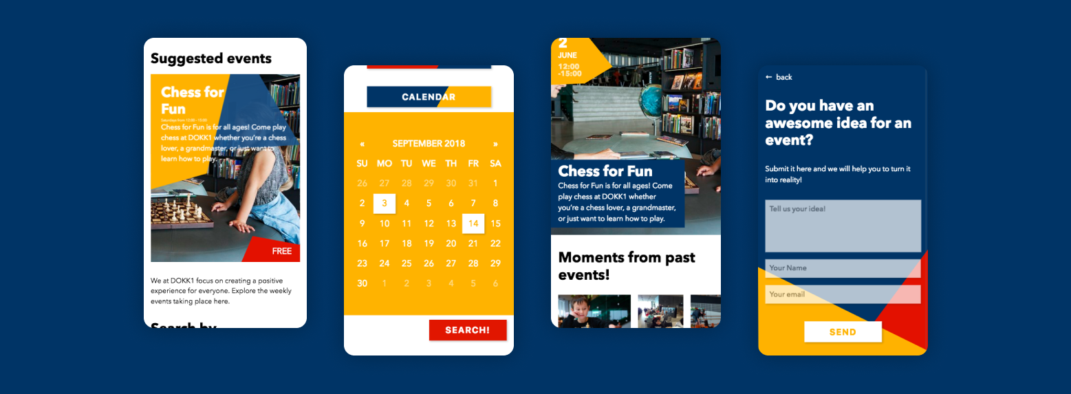
dokk1 mobile mockups

User Testing

As the main focus was put onto our target audience, a user testing was crucial for us. We had to make sure every decision has a meaning, so we made a testing session with our target audience, youth.

We also used different tools, for example talking aloud (recorded videos and Loom), or site mapping.

dokk1 user testing loom

Conclusion

Cooperation with DOKK1, such a complex client, gave us an insight into how it actually might look in the real life.

I gained a lot of UX related knowledge, how to construct a field user research, or work in a creative team!