cover picture

Quiz: better UX in Antikmuseet

client Antikmuseet date March 2018 range of work UX / UI design, PHP

In this case, our team took a look on how to improve user experience of high school students in a museum of antiquities in Aarhus.

The Client

Antikmuseet is a museum of ancient art with free entrance in Aarhus, that belongs to Aarhus University. 

Its collection is growing steadily and nowadays they have around 4000 antiquities. Some are originals, some of them are artificial. Most of the artefacts were donated, as the financial budget of the museum is very low.

client
https://en.wikipedia.org/wiki/Museum_of_Ancient_Art,_Aarhus

The Problem

Our task was to create an interactive website (this was a school assignment), that’d support the user experience of the museum, and bring more visitors. The target audience was not set, but it should support the first problem.

One requirement was to engage the users with the artefacts themselves, not only the app. Another one to make it “edutaining” — educational and entertaining.

User Stories

Thanks to provided basic research, we found out that the most problematic target audience might be high-school groups. They are a big part of the visitors, but “go there, because they have to”.

We then created user stories for both teachers and students based on our field research, that told us more about the solution.

Idea Generation

During our classes, we were also taught how to generate ideas, so we used this advantage in our process. We tried to ideate as many ideas as possible by brainstorming, doing reverse brainstorm, or trying to pair our client with a famous brand or random object, e.g. a ball.

All these ideas were supporting the perception of Antikmuseet being fun and educative at the same time.

Production

From all of our ideas we chose the most entertaining one, a Kahoot-like quiz. High-school students in Denmark are very familiar with this game, and it’s widely used.

Iterating the process, we started with creating questions that would make the users go around the museum and seek for the right answers. After this, we sketched a simple and easy-to-use user interface, that we backed up with testing.
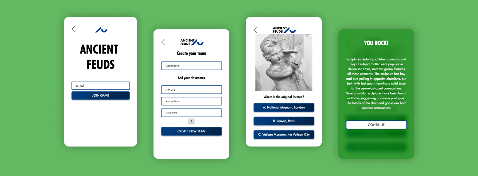
We also collaborated in our team during the whole process. Here using Figma cloud-based app.

Outcome

The final prototype creates a value for the museum by making learning more fun, and for the teachers to see the students’ results, as they will get a result sheet for each team after the game is done.

To embrace collaboration amongst students, we made them sign up in teams, choosing also their team name (as we found out this supports the team spirits more than having a simple group of students).